
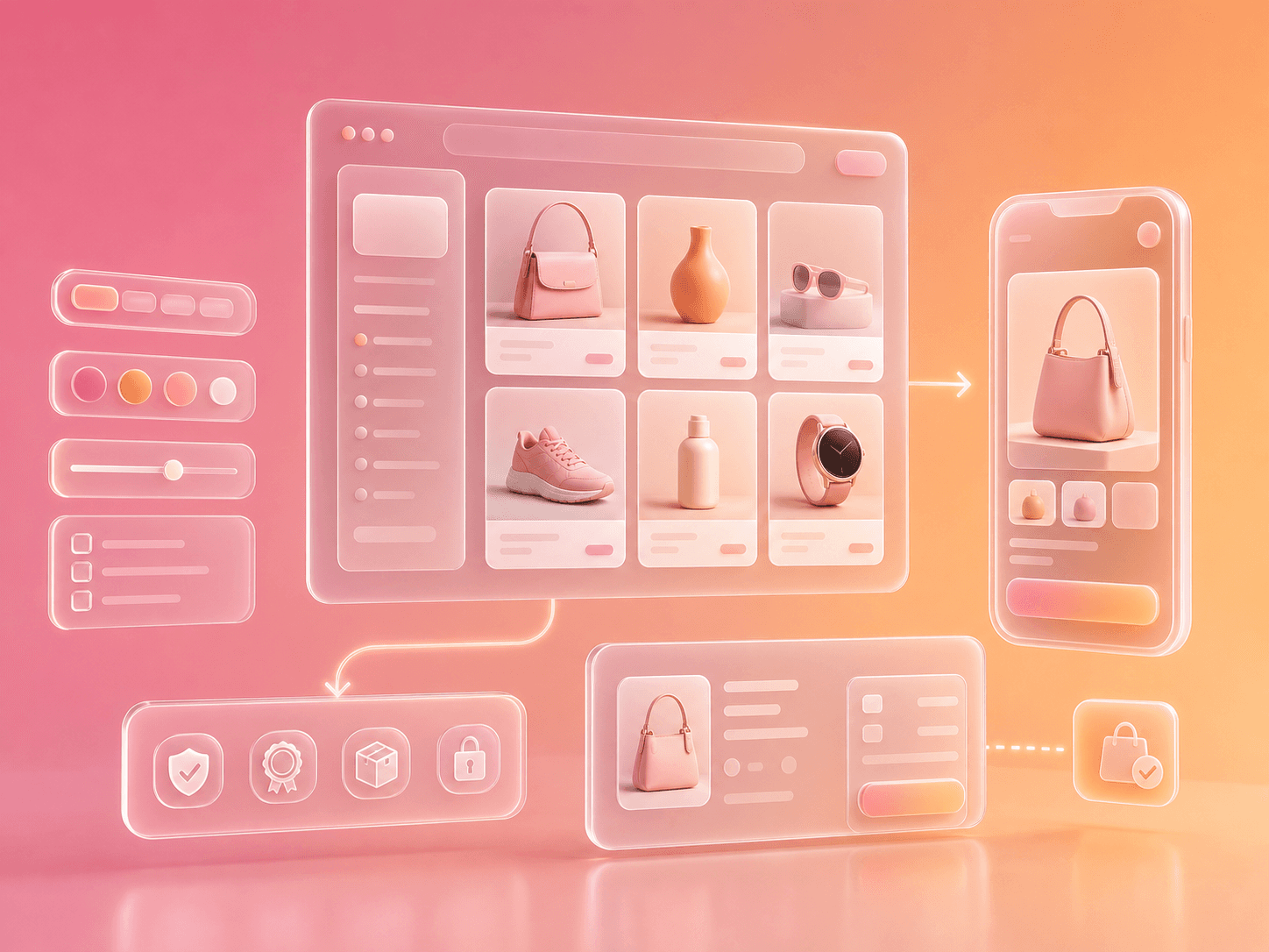
Quick Overview
What this covers: The ecommerce website design principles that actually influence revenue: product discovery, navigation, filtering, product pages, trust, mobile UX, page speed, checkout friction, SEO, and post-launch testing.
Who this is for: Ecommerce founders, DTC teams, Shopify merchants, designers, and marketers planning a redesign or trying to improve conversion without rebuilding blindly.
Key takeaway: Good ecommerce design is not decoration. It reduces uncertainty, speeds up product discovery, makes comparison easier, removes checkout effort, and gives shoppers enough confidence to buy.
Reading time: 14 minutes
Table of Contents
What Ecommerce Website Design Really Means
The 15 Principles
The Ecommerce Design Scorecard
Unconventional Design Fixes Most Stores Miss
How to Redesign Without Breaking Revenue
Frequently Asked Questions
What Ecommerce Website Design Really Means
Ecommerce website design is the structure, content, visual system, and interaction pattern that helps shoppers find the right product, trust the store, and complete a purchase.
That includes visuals, but it is much bigger than visuals.
Strong ecommerce design answers shopper questions in the order they appear:
Am I in the right place?
Do they sell what I need?
Can I find the right product quickly?
Can I compare options?
Do I trust the product?
Do I trust the store?
What will shipping, returns, and delivery look like?
Is checkout going to be annoying?
Is this worth buying now?
If the design does not answer those questions, the site may look premium and still underperform.
Baymard's ecommerce UX benchmark covers hundreds of ecommerce sites across homepage, navigation, search, product lists, filtering, product pages, cart, checkout, accounts, and site-wide interaction patterns. Source: Baymard ecommerce UX benchmark.
The lesson is simple: ecommerce design is a system, not a homepage.
The 15 Principles
1. Design for Product Discovery Before Brand Story
Brand matters, but shoppers usually arrive with a job to do.
On ecommerce sites, product discovery should be obvious:
Clear navigation categories
Search that is easy to find
Collection tiles that match shopping intent
Best sellers and new arrivals where relevant
Filters that reflect how customers choose
The homepage should not be a movie trailer if shoppers need a map.
Practical test: Hand someone your homepage for five seconds. If they cannot tell what you sell, who it is for, and where to click next, the design is underperforming.
2. Build Navigation Around Buyer Language
Navigation should use customer words, not internal taxonomy.
Weak labels:
Essentials
Solutions
The Edit
Systems
Experiences
Stronger labels:
Running Shoes
Linen Bedding
Skincare Sets
Protein Powder
Wedding Guest Dresses
Creative labels are fine inside campaigns. Core navigation should be boring enough to be instantly understood.
3. Make Filters Commercial, Not Generic
Generic filters like price, color, and size are useful, but they are rarely enough.
Better filters match buying criteria:
Category | High-value filters |
|---|---|
Apparel | Fit, occasion, fabric, inseam, neckline, weather |
Beauty | Skin type, concern, ingredient, finish, routine step |
Furniture | Room, material, dimensions, delivery time, assembly |
Supplements | Goal, diet type, flavor, serving size, allergen |
Electronics | Compatibility, use case, battery, connection type |
The best filters reduce decision effort. The worst filters expose database fields nobody shops by.
4. Treat Collection Pages Like Landing Pages
For SEO and conversion, collection pages are often more important than the homepage.
A strong collection page should include:
A concise intro explaining the category
Useful filters
Sort options
Product cards with meaningful comparison data
Internal links to related collections
FAQs for common objections
Social proof or trust where relevant
Do not bury 1,000 words of generic SEO copy under the grid. Put useful guidance where it helps shoppers decide.
For the SEO side of this, see our Shopify SEO services guide.
5. Product Cards Should Help People Compare
Product grids often waste space.
A better product card can show:
Product name
Price and sale state
Review rating
Key variant colors
One differentiating benefit
Availability or shipping cue
Quick add only when variant selection is simple
Avoid product cards that force shoppers to open every item just to understand the difference.
6. Product Pages Need a Decision Hierarchy
A product page should not throw everything at the shopper at once.
Use a hierarchy:
What is it?
Who is it for?
Why is it better?
What proof exists?
What are the practical details?
What happens after purchase?
Good PDP design turns uncertainty into confidence.
PDP element | What it should answer |
|---|---|
Gallery | What does it look like in real use? |
Product title | What exactly am I buying? |
Price | What is the offer? |
Variants | Which option is right for me? |
Benefits | Why this product? |
Specs | Will it fit, work, or suit me? |
Reviews | Did it work for people like me? |
Shipping/returns | What is the risk? |
7. Show the Product in Context
Studio shots are useful. Context shots sell.
For ecommerce website design, product media should include:
Clean product image
Scale reference
In-use photo
Detail shot
Material or texture close-up
Short video or motion clip where helpful
Comparison image for sizes or bundles
Unconventional but useful: add a "what buyers misunderstand" media block for products with returns caused by size, color, fit, or compatibility confusion.
8. Put Trust Near the Risk
Trust badges in the footer are not enough.
Place trust cues where hesitation happens:
Hesitation | Trust cue |
|---|---|
Is this good quality? | Reviews, materials, guarantees, testing details |
Will it arrive on time? | Delivery estimate near CTA |
What if it does not fit? | Returns policy near variant selection |
Is this brand real? | Press, founder note, customer photos |
Is payment safe? | Secure checkout/payment methods near cart |
Trust is not a decoration. It is an objection-handling system.
9. Design Mobile as the Primary Store
Most ecommerce teams approve designs on desktop and discover mobile problems later.
Mobile design needs special attention:
Sticky add-to-cart that does not cover content
Tap targets with enough space
Filters that are easy to open and apply
Fast image loading
Variant selectors that are not tiny
Clear cart feedback
Search visible without hunting
Accordions that do not hide critical buying info too deeply
The mobile product page is where many ecommerce redesigns quietly fail.
10. Speed Is a Design Decision
Design choices affect performance.
Google's Core Web Vitals focus on loading, interactivity, and visual stability: Largest Contentful Paint, Interaction to Next Paint, and Cumulative Layout Shift. Google recommends LCP within 2.5 seconds, INP of 200 milliseconds or less, and CLS of 0.1 or less at the 75th percentile. Source: web.dev Core Web Vitals.
That means design should control:
Hero image size
Video usage
Fonts
App embeds
Scripts
Animation
Layout shifts
Product image dimensions
The prettiest page is not successful if it loads after the shopper loses patience.
11. Make Offers Clear Without Making the Site Cheap
Discounts, bundles, free shipping, and subscriptions should be clear.
But clarity does not require shouting.
Better offer design:
Show savings in context.
Explain bundle logic.
Make subscription terms plain.
Show free shipping threshold in cart.
Avoid fake urgency.
Keep promo code behavior predictable.
If the shopper has to calculate the deal, the design is doing too little.
12. Reduce Checkout Effort
Checkout design is about perceived effort, not just step count.
Baymard's checkout research found that the number of fields matters more than the number of steps, and that reducing visible fields improves checkout UX. Source: Baymard checkout form field research.
Before customizing checkout, ask:
Can we hide optional fields?
Can we reduce decisions?
Can shipping options be clearer?
Is account creation delayed until after purchase?
Are coupon fields creating distraction?
Are error messages specific enough?
The goal is not a clever checkout. The goal is a low-effort checkout.
13. Design for Returns and Support Before They Happen
Good ecommerce design reduces customer support load.
Add clarity around:
Sizing
Fit
Care instructions
Compatibility
Delivery windows
Return conditions
Warranty
Setup
Ingredients or materials
This content does not only help conversion. It reduces refunds, support tickets, and bad reviews.
14. Build Reusable Sections, Not One-Off Pages
The best ecommerce websites are easy to operate after launch.
Your design system should include reusable blocks:
Hero sections
Product feature rows
Comparison tables
Review modules
Before/after blocks
Collection intros
FAQ blocks
Trust banners
Press strips
Ingredient/material cards
Size-guide modules
If every campaign page requires a developer, the design system is not finished.
For Shopify-specific build decisions, read our Shopify development agency and custom Shopify theme development guides.
15. Measure the Design After Launch
Design does not end at launch.
Track:
Conversion rate by landing page
Product page add-to-cart rate
Cart abandonment
Checkout completion
Search usage and search conversion
Filter usage
Top exit pages
Return reasons
Support ticket themes
Organic traffic to collections
Redesign rule: If you do not know what metric the design is meant to improve, you are decorating.
The Ecommerce Design Scorecard
Use this quick scoring table before a redesign.
Area | Score 1 looks like | Score 5 looks like |
|---|---|---|
Navigation | Vague labels, hidden categories | Clear buyer-language taxonomy |
Product discovery | Shoppers browse blindly | Search, filters, collections, and recommendations work together |
Product pages | Pretty but incomplete | Clear hierarchy, proof, details, objections, and CTA |
Trust | Generic badges | Trust cues placed at hesitation points |
Mobile UX | Desktop shrunk down | Mobile-first controls and layout |
Performance | Heavy media and scripts | Fast, stable, measured templates |
Checkout | Extra decisions and fields | Low-effort, clear, predictable flow |
Operability | Hard-coded pages | Reusable sections and CMS controls |
Score your current site before asking for a new design direction. The score will reveal where the redesign should focus.
Unconventional Design Fixes Most Stores Miss
Add a "Choose This If" Block
For stores with similar products, add a short decision block:
Product | Choose this if |
|---|---|
Starter kit | You are new and want the simplest setup |
Pro kit | You already know the category and want more control |
Refill pack | You already own the core product |
This reduces comparison fatigue.
Add Negative Fit Guidance
Most product pages only say who the product is for. Add who it is not for.
Example:
Not the best fit if you need a very firm mattress, prefer synthetic fabrics, or want same-day delivery.
This builds trust and reduces returns.
Add Search Terms to Navigation Planning
Use site search data, Search Console queries, and customer support phrases to name categories. Your navigation should reflect actual demand, not just internal merchandising language.
Design for the Second Purchase
Most ecommerce design focuses on first purchase. Add features that help repeat buying:
Reorder links
Refill reminders
Subscription clarity
Accountless order lookup
Product education after purchase
Cross-sell based on ownership, not random best sellers
Retention is a design problem too.
How to Redesign Without Breaking Revenue
Use a phased approach.
Phase | What to do |
|---|---|
Audit | Review analytics, heatmaps, search data, support tickets, returns, SEO pages |
Prioritize | Identify revenue pages: homepage, top collections, top PDPs, cart, checkout |
Prototype | Test navigation, PDP hierarchy, mobile layout, and collection templates |
Build | Create reusable sections and templates |
QA | Test devices, speed, tracking, forms, cart, checkout, SEO, redirects |
Launch | Monitor conversion, revenue, errors, rankings, and customer support |
Iterate | Improve based on behavior, not opinions |
Do not redesign every page equally. Redesign around revenue paths.
Frequently Asked Questions
What is ecommerce website design?
Ecommerce website design is the planning and creation of an online store experience that helps shoppers discover products, compare options, trust the brand, and complete checkout.
What makes a good ecommerce website?
A good ecommerce website has clear navigation, useful search and filters, strong product pages, trustworthy content, fast performance, mobile-first UX, clear offers, and low-friction checkout.
Which ecommerce website builder is best?
It depends on the business. Shopify is usually strongest for product-based ecommerce brands that want reliable commerce infrastructure. WooCommerce can work well for content-heavy WordPress businesses. BigCommerce can suit complex catalogs. The builder matters less than execution.
How much does ecommerce website design cost?
A basic template setup can cost a few thousand dollars. A custom Shopify or ecommerce redesign can range from $15,000 to $100,000+ depending on design depth, theme development, integrations, migration, SEO, and QA.
Should ecommerce design focus on homepage or product pages?
Product pages and collection pages usually deserve more attention than the homepage because they are closer to purchase intent. The homepage matters, but it should not consume the whole redesign budget.
Final Recommendation
The best ecommerce website design makes buying feel easier.
It helps shoppers find products, compare choices, understand value, trust the brand, and complete checkout without unnecessary effort. It also gives your team reusable tools to keep improving after launch.
Start with the customer journey. Then design the store around the decisions shoppers actually need to make.
Planning an ecommerce redesign? Talk to Skyloom Studios. We will help you identify which pages, templates, and UX improvements are most likely to move revenue first.